Introducing the Power of Trust, Shiftee Blue
2021-05-14

“A clear shade of azure”
This describes Shiftee’s official brand color.

A brand color is the unique color that represents a brand. It goes beyond the product and serves as one of the most powerful design elements that unify the entire brand experience. This is why people often associate a brand with its symbol and color together.
We call the color that represents Shiftee “Shiftee Blue.” What kind of impression does it give you?
Let us explore the symbolism behind Shiftee’s brand color.
Why ‘BLUE’?
A time and attendance solution is built on trust — between administrators and employees, and between users and the product. When choosing a brand color, the first and foremost question was: “Does this color inspire trust?”

From global corporations and financial institutions to emerging startups, it’s easy to find brands represented by the color blue. That’s because blue is widely recognized as a color that conveys smartness, technology, and above all, trust. This universal perception strongly influences how colors are received, and Shiftee wanted to align with that trusted tradition.
Cool tones are perceived as more trustworthy than warm tones, possibly because they emphasize utility over emotion. From this perspective, blue is a perfect fit for a B2B solution.
Connection and Reach
After deciding on the general tone of blue, the next step was to determine which specific shade would best suit Shiftee.
This is where we focused on Shiftee’s core value: connectivity.
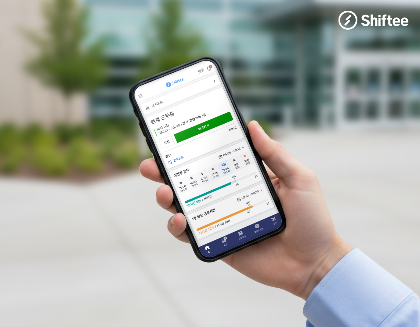
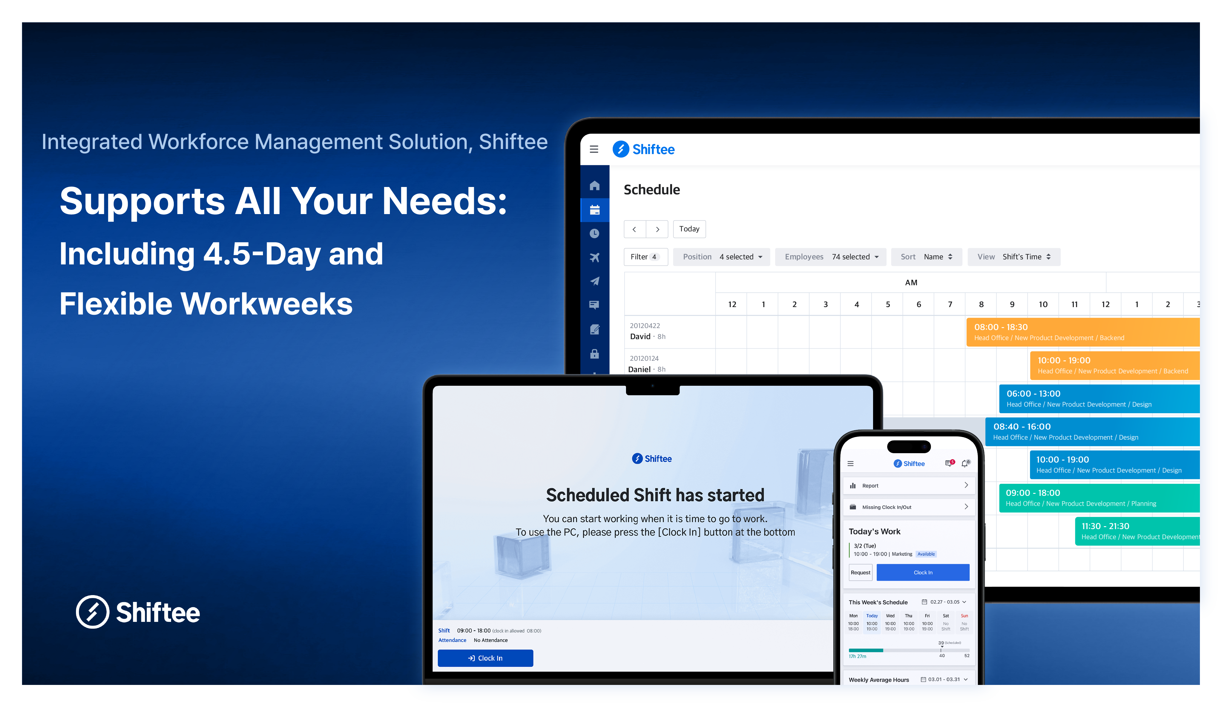
Shiftee began by unifying fragmented time and attendance features into a single solution. We connect these fragmented tools and deliver them to companies as a cohesive platform. Ultimately, at each workplace, Shiftee acts as a bridge between administrators and employees. The transparency of work schedules, attendance records, and simplified approval processes further strengthens this connectivity.
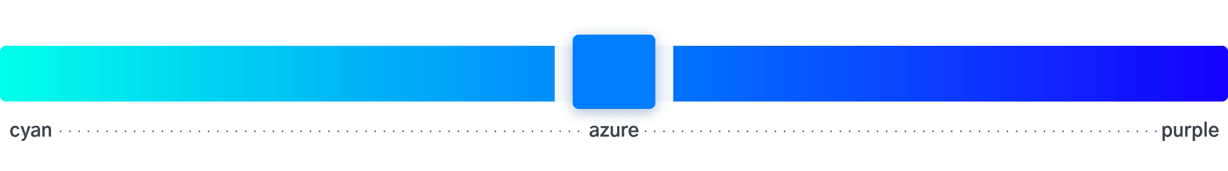
We sought a midpoint in the spectrum that ranges from blue-green (bluish green) to purple-blue (bluish purple) — colors generally classified as blue. This middle range is known as azure. Sometimes referred to as sky blue, it reflects the color of nature we see daily, evoking positive emotions and familiarity.
Weight for Stability
When finalizing the saturation and brightness of the color, we focused on achieving a sense of stability. A time and attendance solution must remain stable while adapting to a constantly changing environment.
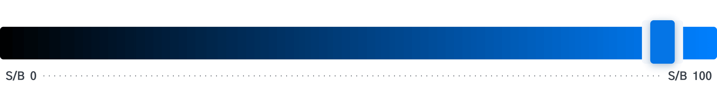
High saturation and brightness give a sharp, clear image. On the other hand, dull or murky colors evoke uncertainty, which we wanted to avoid. However, if the color is too saturated and bright, it may come across as overly aggressive. To strike the right balance, we made subtle adjustments to saturation and brightness, enhancing the sense of stability in the color.
Singular Focus on Shiftee Blue
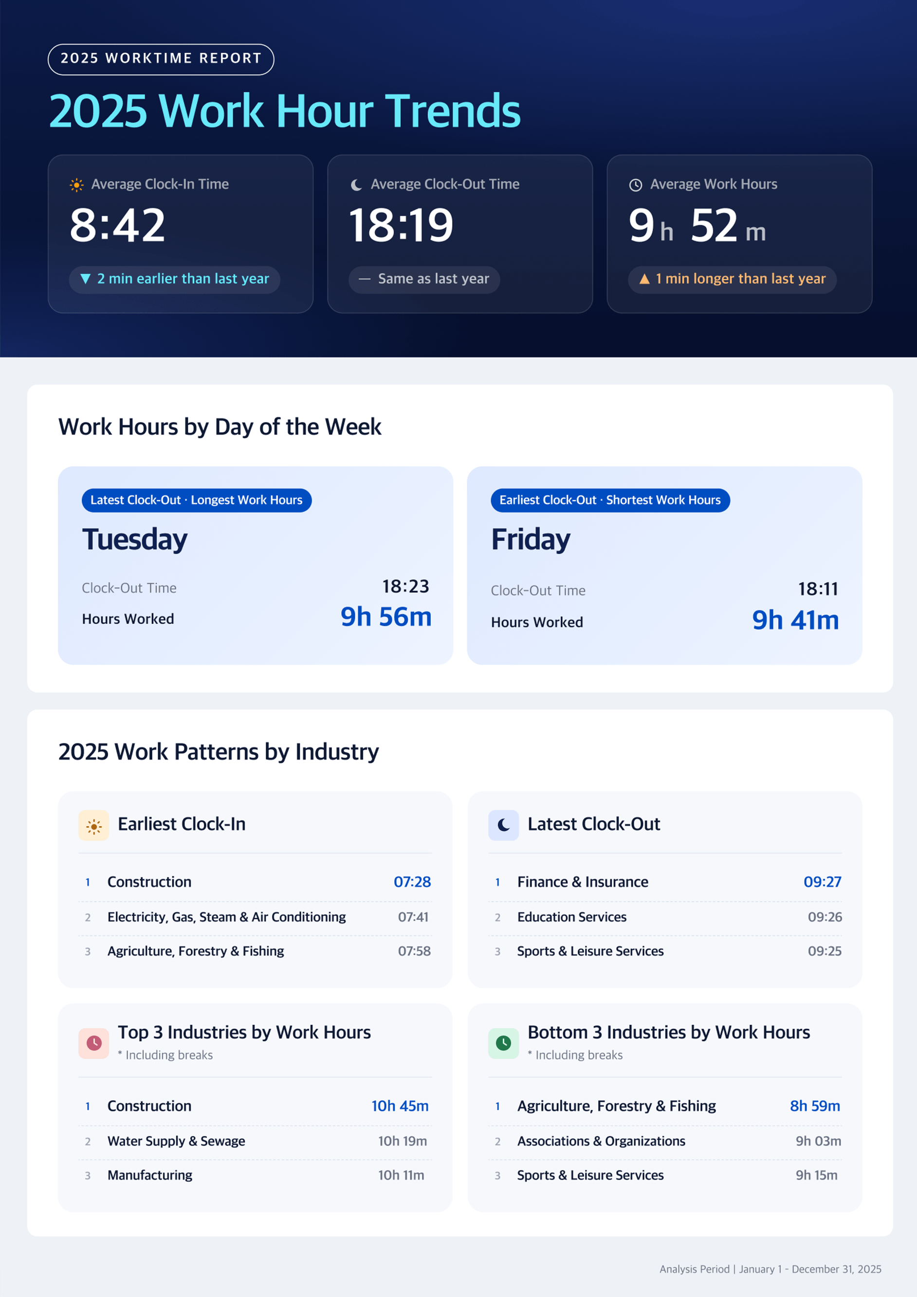
If you explore Shiftee, you'll notice that apart from blue and neutral tones, other colors are used only in minimal areas — such as for visualizing data.
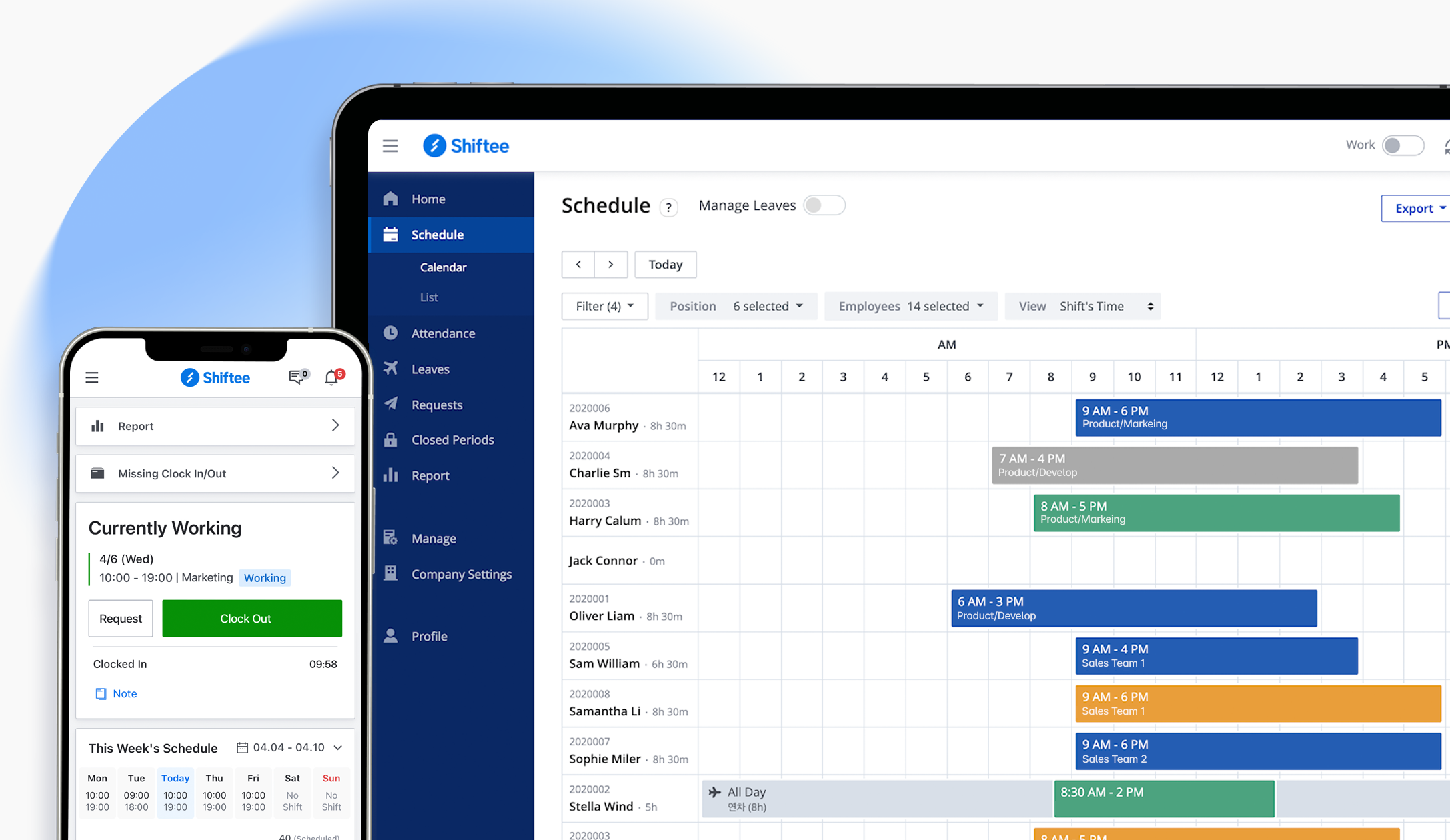
Across all user experience touchpoints — including the website, web app, and mobile app — Shiftee maintains a monochromatic palette centered on Shiftee Blue. This not only reinforces the brand image but also ensures that color usage doesn’t interfere with the readability of data-heavy components.
Shiftee is committed to delivering a consistently exceptional experience.
When citing the content, be sure to indicate the source according to copyright law.